
一、布局原理
- flex是flexible Box的缩写,用来为盒状模型提供最大的灵活性,任何一个容器都可以指定为flex布局。
- 当为父盒子设置为flex布局以后,子元素的float、clear和vertical-align属性将失效。
- 采用flex布局的元素,称为flex容器,他的所有子元素自动成为容器成员,称为flex项目
- flex布局原理:通过父盒子添加flex属性,控制子盒子的位置和排列方式
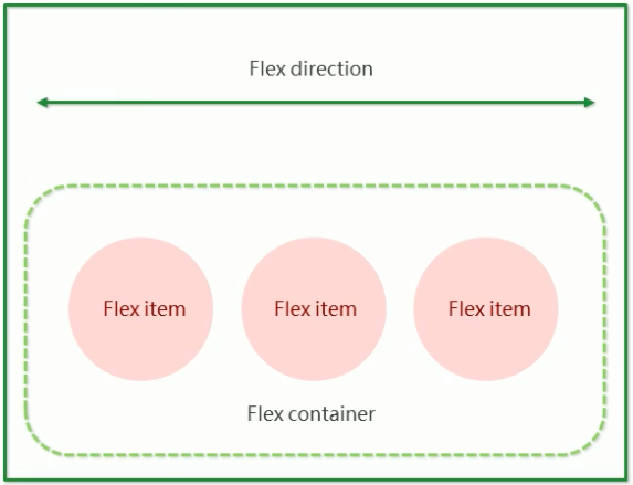
二、flex属性
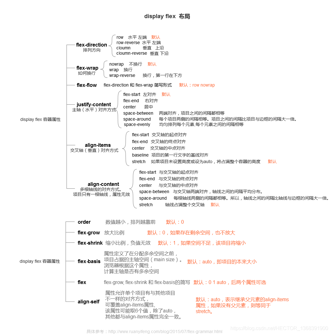
三、常见样式设置
| 需求 | 父盒子 | 子盒子 | 效果 |
|---|---|---|---|
| 水平方向居中 | justify-content: center; | 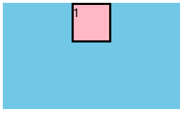 |
|
| 垂直方向居中 | flex-direction: column; | 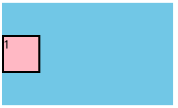 |
|
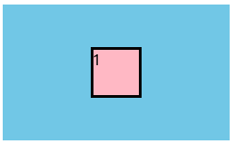
| 水平垂直方向居中 | flex-direction: column; justify-content: center; align-items: center; |
 |
|
| 左右盒子贴边,中间盒子居中 | justify-content: space-between; | 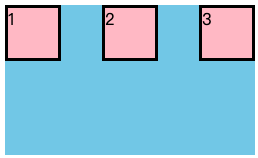 |
|
| 上线盒子贴边,中间盒子居中 | flex-wrap: wrap; | 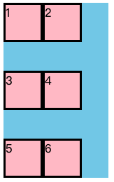 |
|
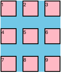
| 上下左右盒子贴边,中间盒子居中 | flex-wrap: wrap; justify-content: space-between; align-content: space-between; |
 |
|
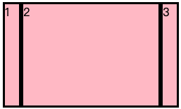
| 两边盒子宽度固定,剩余空间给中间盒子 | span:nth-child(1){width: 20px;} span:nth-child(2){flex:1;} span:nth-child(3){width: 20px;} |
 |
|
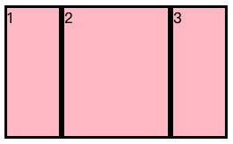
| 三个盒子比例为1:2:1 | span:nth-child(1){flex:1;} span:nth-child(2){flex:2;} span:nth-child(3){flex:1;} |
 | | |
四、flex父项属性
1. flex-direction(主轴的方向)
- 主轴和侧轴是变化的,当flex-direction设置主轴后,剩下的就是侧轴,子元素跟着主轴来排列
| 属性值 | 说明 | 效果 |
|---|---|---|
| row | 从左到右(默认) | 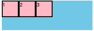 |
| row-reverse | 从右到左 | 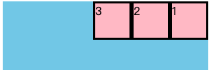 |
| column | 从上到下 | 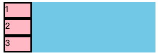 |
| column-reverse | 从下到上 | 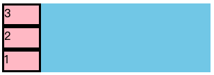 |
<!DOCTYPE html>
<html lang="en">
<head>
    <meta charset="UTF-8">
    <title>flex布局</title>
    <style>
        div{
            display: flex;
            width: 300px;
            height: 100px;
            background-color: skyblue;
            /*从左到右排列*/
            /*flex-direction: row;*/
            /*从右到左排列*/
            /*flex-direction: row-reverse;*/
            /*从上到下排列*/
            /*flex-direction: column;*/
            /*从下到上排列*/
            flex-direction: column-reverse;
        }
        div span{
            width: 50px;
            height: 50px;
            background-color: pink;
            margin-right: 10px;
            border: 3px black solid;
        }
    </style>
</head>
<body>
<div>
    <span>1</span>
    <span>2</span>
    <span>3</span>
</div>
</body>
</html>
2.justify-content(主轴上的子元素排列方式)
- 设置在主轴上的对齐方式
| 属性 | 说明 | 效果 |
|---|---|---|
| flex-start | 从头开始,如果主轴x轴,则从左到右(默认值) | 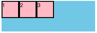 |
| flex-end | 从尾部开始排列 | 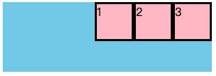 |
| center | 在主轴居中对齐 | 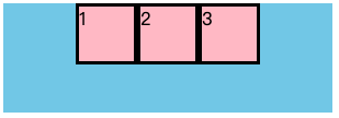 |
| space-around | 平分剩余空间 | 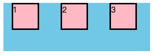 |
| space-between | 两边贴边,平分剩余空间 | 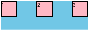 |
<!DOCTYPE html>
<html lang="en">
<head>
    <meta charset="UTF-8">
    <title>flex布局</title>
    <style>
        div{
            display: flex;
            width: 300px;
            height: 100px;
            background-color: skyblue;
            /*主轴从头开始排列*/
            /*justify-content: flex-start;*/
            /*主轴从尾部开始排列*/
            /*justify-content: flex-end;*/
            /*主轴居中对齐*/
            /*justify-content: center;*/
            /*主轴子元素平分剩余空间*/
            /*justify-content: space-around;*/
            /*主轴子元素两边贴边,然后平分剩余空间*/
            justify-content: space-between;
        }
        div span{
            width: 50px;
            height: 50px;
            background-color: pink;
            border: 3px black solid;
        }
    </style>
</head>
<body>
<div>
    <span>1</span>
    <span>2</span>
    <span>3</span>
</div>
</body>
</html>
3.flex-wrap(子元素是否换行)
- 默认情况下,所有子盒子都排列在一条线上,默认不换行
| 属性 | 说明 | 效果 |
|---|---|---|
| nowarp | 不换行(默认) | 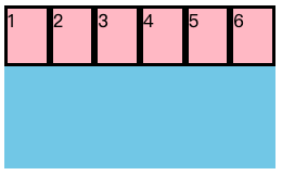 |
| warp | 换行 | 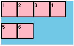 |
<!DOCTYPE html>
<html lang="en">
<head>
    <meta charset="UTF-8">
    <title>flex布局</title>
    <style>
        div{
            display: flex;
            width: 250px;
            height: 150px;
            background-color: skyblue;
            /*子盒子超出时不换行*/
            flex-wrap:nowrap;
            /*子盒子超出时换行*/
            /*flex-wrap:wrap;*/
        }
        div span{
            width: 50px;
            height: 50px;
            background-color: pink;
            border: 3px black solid;
        }
    </style>
</head>
<body>
<div>
    <span>1</span>
    <span>2</span>
    <span>3</span>
    <span>4</span>
    <span>5</span>
    <span>6</span>
</div>
</body>
</html>
4.align-items(侧轴上的子元素排列方式-单行)
- 控制子盒子在侧轴上的排列方式,子盒子为单行时使用
| 属性值 | 说明 | 效果 |
|---|---|---|
| flex-start | 从上到下(默认) | 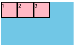 |
| flex-end | 从下到上 | 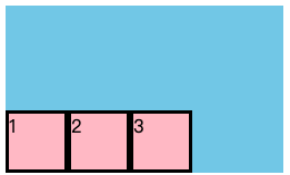 |
| center | 侧轴居中 | 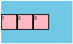 |
| stretch | 拉伸(不要给子盒子设置高度) | 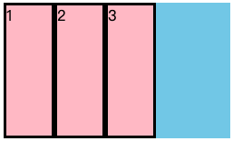 |
<!DOCTYPE html>
<html lang="en">
<head>
    <meta charset="UTF-8">
    <title>flex布局</title>
    <style>
        div{
            display: flex;
            width: 250px;
            height: 150px;
            background-color: skyblue;
            /*侧轴从上到下排列*/
            /*align-items: flex-start;*/
            /*侧轴从下到上排列*/
            /*align-items: flex-end;*/
            /*侧轴居中排列*/
            /*align-items: center;*/
            /*侧轴拉伸*/
            align-items: stretch;
        }
        div span{
            width: 50px;
            /*height: 50px;*/
            background-color: pink;
            border: 3px black solid;
        }
    </style>
</head>
<body>
<div>
    <span>1</span>
    <span>2</span>
    <span>3</span>
</div>
</body>
</html>
5.align-content(侧轴上的子元素排列方式-多行)
- 控制子盒子在侧轴上的排列方式,子盒子为多行时使用,记得设置flex-wrap: wrap(换行排列)
| 属性值 | 说明 | 效果 |
|---|---|---|
| flex-start | 从上到下(默认) | 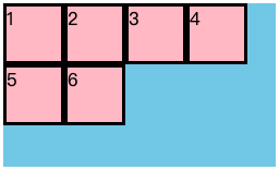 |
| flex-end | 从下到上 | 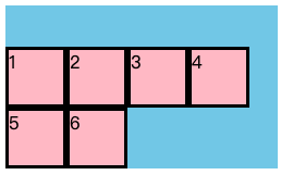 |
| center | 居中 | 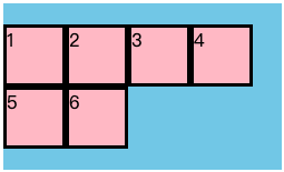 |
| space-between | 两边贴边,平分剩余空间 | 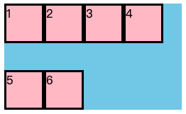 |
| stretch | 拉伸(子盒子不要给高度) | 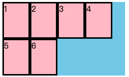 |
<!DOCTYPE html>
<html lang="en">
<head>
    <meta charset="UTF-8">
    <title>flex布局</title>
    <style>
        div{
            display: flex;
            width: 250px;
            height: 150px;
            background-color: skyblue;
            /*换行排列*/
            flex-wrap: wrap;
            /*侧轴从上到下排列*/
            /*align-content: flex-start;*/
            /*侧轴从下到上排列*/
            /*align-content: flex-end;*/
            /*侧轴居中排列*/
            /*align-content: center;*/
            /*侧轴拉伸*/
            /*align-content: stretch;*/
            /*侧轴两边贴边*/
            align-content: space-between;
        }
        div span{
            width: 50px;
            height: 50px;
            background-color: pink;
            border: 3px black solid;
        }
    </style>
</head>
<body>
<div>
    <span>1</span>
    <span>2</span>
    <span>3</span>
    <span>4</span>
    <span>5</span>
    <span>6</span>
</div>
</body>
</html>
6.flex-flow(复合属性,相当于同时设置flex-direction和flex-wrap)
- 设置以列主轴方向,并换行
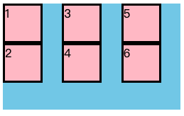
<!DOCTYPE html>
<html lang="en">
<head>
    <meta charset="UTF-8">
    <title>flex布局</title>
    <style>
        div {
            display: flex;
            width: 250px;
            height: 150px;
            background-color: skyblue;
            /*已列方向为主轴*/
            flex-direction: column;
            /*超出后换行*/
            flex-wrap:wrap;
            /*以上两个属性合写*/
            flex-flow:column wrap;
        }

        div span {
            width: 50px;
            height: 50px;
            background-color: pink;
            border: 3px black solid;
        }
    </style>
</head>
<body>
<div>
    <span>1</span>
    <span>2</span>
    <span>3</span>
    <span>4</span>
    <span>5</span>
    <span>6</span>
</div>
</body>
</html>
五、flex子项属性
1.flex(子项占剩余空间份数)
| 三个子盒子平均分配宽度 | span1(flex:1) span2(flex:1) span3(flex:1) |
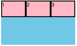 |
|---|---|---|
| 1号和3号盒子占一份,2号盒子占两份 | span1(flex:1) span2(flex:2) span3(flex:1) |
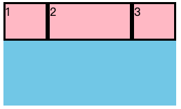 |
| 1号和3号盒子宽20px,2号盒子占剩余空间 | span1(width:20px) span2(flex:1) span3(width:20px) |
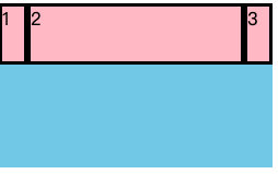 |
<!DOCTYPE html>
<html lang="en">
<head>
    <meta charset="UTF-8">
    <title>flex布局</title>
    <style>
        div {
            display: flex;
            width: 250px;
            height: 150px;
            background-color: skyblue;
        }

        div span {
            /*width: 50px;*/
            height: 50px;
            background-color: pink;
            border: 3px black solid;
        }

        span:nth-child(1) {
            width: 20px;
        }

        span:nth-child(2) {
            flex: 1;
        }

        span:nth-child(3) {
            width: 20px;
        }
    </style>
</head>
<body>
<div>
    <span>1</span>
    <span>2</span>
    <span>3</span>
</div>
</body>
</html>
2.align-self(子项在侧轴的排列方式)
- 设置子盒子对齐方式,可覆盖align-items熟悉,默认继承父元素的align-items
| 2号盒子底部排列 | span2(align-self: flex-end) | 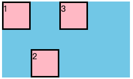 |
|---|---|---|
| 2号盒子单独居中 | span2(align-self: center) | 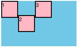 |
| 2号盒子拉伸 | span2(align-self: stretch) | 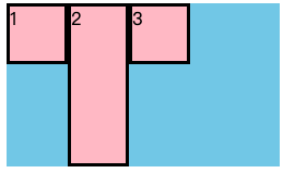 |
<!DOCTYPE html>
<html lang="en">
<head>
    <meta charset="UTF-8">
    <title>flex布局</title>
    <style>
        div {
            display: flex;
            width: 250px;
            height: 150px;
            background-color: skyblue;
        }

        div span {
            width: 50px;

            background-color: pink;
            border: 3px black solid;
        }
        span:nth-child(1),span:nth-child(3){
            height: 50px;
        }
        span:nth-child(2) {
            /*单独底部排列*/
            /*align-self: flex-end;*/
            /*单独居中排列*/
            /*align-self: center;*/
            /*单独居中拉伸*/
            align-self: stretch;
        }
    </style>
</head>
<body>
<div>
    <span>1</span>
    <span>2</span>
    <span>3</span>
</div>
</body>
</html>
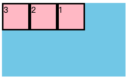
3.order(子项排列先后顺序)
- 设置排列顺序,数值越小,越靠前
| 排列顺序改为213 | span2(order:-1) | 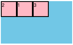 |
|---|---|---|
| 排列顺序改为321 | span1(order:-1) span2(order:-2) span3(order:-3) |
 |
<!DOCTYPE html>
<html lang="en">
<head>
    <meta charset="UTF-8">
    <title>flex布局</title>
    <style>
        div {
            display: flex;
            width: 250px;
            height: 150px;
            background-color: skyblue;
        }

        div span {
            width: 50px;
            height: 50px;
            background-color: pink;
            border: 3px black solid;
        }
        span:nth-child(1) {
            order: -1;
        }
        span:nth-child(2){
            order: -2;
        }
        span:nth-child(3) {
            order: -3;
        }
    </style>
</head>
<body>
<div>
    <span>1</span>
    <span>2</span>
    <span>3</span>
</div>
</body>
</html>